

Web design portfolio · Central Coast. Two very different websites, each made to fit
A calm, illustrated site for a wellbeing practice on the Central Coast, and a bold campaign site for a charity bike ride from Germany to the Netherlands. We designed, built and launched both in 2026, and we host them too.

Wellbeing · Central Coast, NSW
Be Me Hum
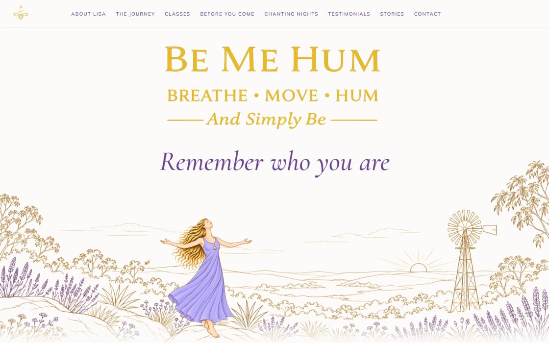
A calm, illustrated website for a breath, movement, humming and chanting practice for women in Saratoga, on the Central Coast.

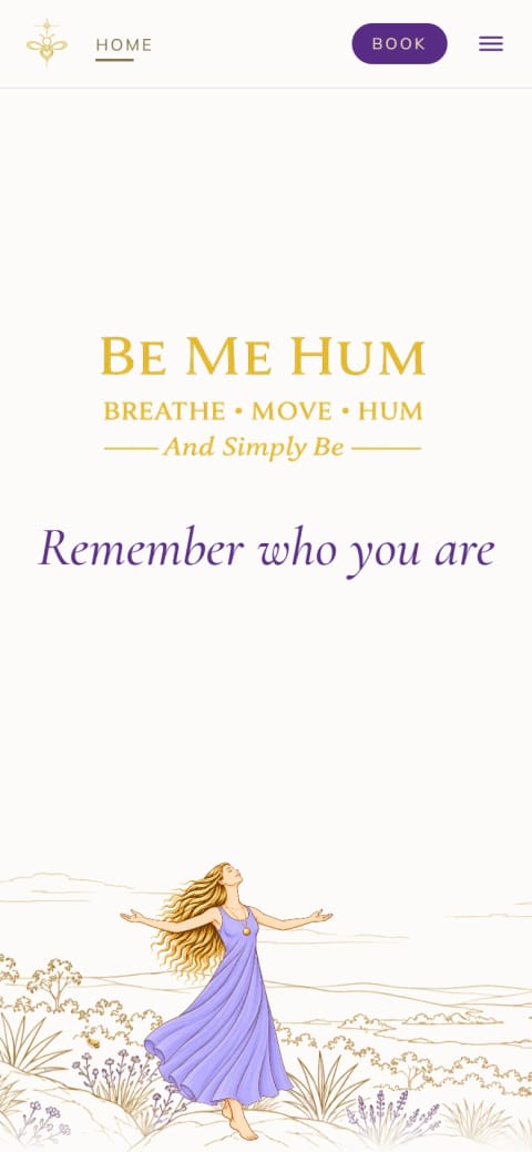
A recording of the Be Me Hum homepage opening on a desktop: the illustrated landscape, the Be Me Hum name and “Remember who you are” fade in, and a figure in a lavender dress starts to sway.
What the site needed to do
Be Me Hum welcomes women with no experience at all. So the site needed to feel as calm as a class, answer first-timers’ questions, and make classes easy to find and book.
What makes it work
We created custom illustrations for the site: gold line work of Australian bush, lavender and bees, led by an animated hero. Be Me Hum’s bee-and-hive theme runs through the layout too, from bees that drift down the page to a honeycomb of testimonials.
On the site
- An animated, illustrated hero made for the site
- A 12-month Journey that highlights the current month
- Answers for first-timers in “Before you come”
- Class booking on the homepage, through the Acuity booking service Be Me Hum uses
- Testimonials set in a honeycomb
- Calmer for visitors who turn on “reduce motion”, with a pause button on the moving quotes
- Launched
- 2026
- What we did
We created the illustrations and the hero animation. The logo is Be Me Hum’s own.
- Colours
Purple · Lavender · Gold · Honey · Warm white
- Fonts
- An elegant serif for headings and a clean sans serif for reading (Cormorant Garamond and Mulish)
- Google’s quality check (Lighthouse)
- 100Accessibility
- 100Best practices
- 100SEO
Scores out of 100 for the homepage on a phone, measured October 2026.


Charity · Netherlands 2026 ride
Riding Together
The campaign website for Pino the Netherlands, an inclusive 700 km charity ride on tandem e-bikes. Teams rode from Waltrop in Germany to Groningen, finishing on 1 October 2026.
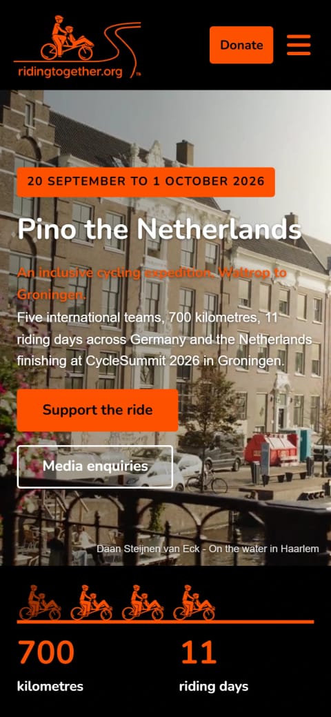
A recording of the Riding Together campaign page opening on a desktop: video of a sunny canal street in Haarlem plays behind “Pino the Netherlands”, and small orange tandems ride along the stats bar.
What the site needed to do
Riding Together offers free tandem rides for people with disability, with trained volunteer pilots. For its ride through Germany and the Netherlands, it needed one place to tell the story and thank its partners. It also needed to point supporters to its donation page.
What makes it work
We used Riding Together’s black, orange and white boldly, so the site feels like a professional sports campaign. Big numbers sum up the ride at a glance. Riders, pilots, partners and the media each get a clear next step.
On the site
- A bold opening with the ride’s dates and two clear buttons: support the ride, or get in touch as media
- An animated stats bar, with small tandems riding along an orange line
- The day-by-day itinerary and the partners behind the ride
- A Donate button on every page, linking to the charity’s donation platform
- Pages for riders, pilots, partners and supporters, alongside the campaign
- Large buttons that are easy to tap, and clear outlines for people who browse with a keyboard
- Launched
- 2026
- What we did
The canal video is credited on Riding Together’s site to Daan Steijnen van Eck (“On the water in Haarlem”). We built the site and the tandem animation.
- Colours
Orange · Black · White · Light grey
- Fonts
- A rounded, friendly font for headings (Nunito), with Arial for reading
- Google’s quality check (Lighthouse)
- 100Accessibility
- 100Best practices
- 100SEO
Scores out of 100 for the homepage on a phone, measured October 2026.


Ready to make your MARK?
Tell us about your business and what you need from your website. We’ll come back with ideas and a free quote, not a sales pitch.
mark@remarkabledesignstudio.com